
6 December 2017
Cartogram maps provide new view of climate change risk
Posted by Nanci Bompey
By Olivia Trani
Scientists have developed cartograms — maps that convey information by contorting areas — to visualize the risks of climate change in a novel way.
Cartograms are maps that change the relative size of areas according to certain characteristics of the region. For example, a cartogram that distorts the shape of countries based on population would cartoonishly expand India’s borders (1.3 billion people) while significantly squishing Australia’s size (23.8 million people), even though in reality Australia’s area is more than twice as big as India.
In a new study, a scientist developed cartograms that enlarge geographical places that host large populations and are particularly vulnerable to climate change hazards. The researcher also created cartograms that expand the shape of countries with higher greenhouse gas emissions and national wealth.
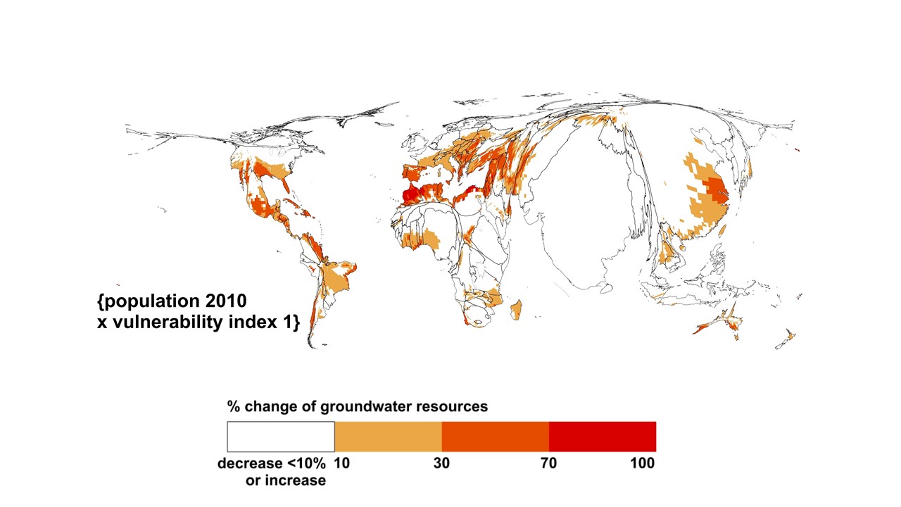
A cartogram set that visualizes the risks of climate change due to decreases of renewable groundwater resources. The degree of climate change hazard (a decrease in groundwater resources by more than 10 percent) is indicated by color. The cartograms distort regions by expanding areas with large populations in 2010 and high degrees of vulnerability.
Credit: Petra Döll
Insights on climate change are often conveyed through thematic maps, where data on certain aspects of climate change is compared across different regions. For example, researchers have made maps that show how climate patterns have impacted or are expected to influence sea level rise, the changing seasons, and the economy.
Conventional thematic maps rely on color codes to convey climate change risk, but cartograms use both color and distortion to represent complex data. By using distortion as a communication tool, cartograms can visualize more information and potentially elicit a greater emotional response from the viewer, according to the new study detailing the new maps that was recently accepted in Earth’s Future, a journal of the American Geophysical Union.
“Of course, I want to do the best objective science, but I also want my work to be policy relevant,” said Petra Döll, a hydrologist at Goethe University Frankfurt’s Institute of Physical Geography, in Frankfurt Germany and author of the new study. “My task is to present the results of my research in the best way possible and to also have a positive impact on the sustainable development of our earth.
Using geographic information system (GIS) software, a kind of technology commonly used for analyzing spatial data, Döll created cartogram sets that visualized climate change’s global impact on groundwater resources. Scientists estimate that 38 percent of the global population will experience declining groundwater resources by 2080 if the world fails to control carbon emission rates. Döll’s maps were based on multiple datasets that describe the level of hazard, exposure and vulnerability related to the planet’s decreasing amount of renewable groundwater resources.
Additionally, Döll examined national wealth and carbon emissions data to develop cartograms that visualize which countries have experienced economic progress built on harmful emissions.
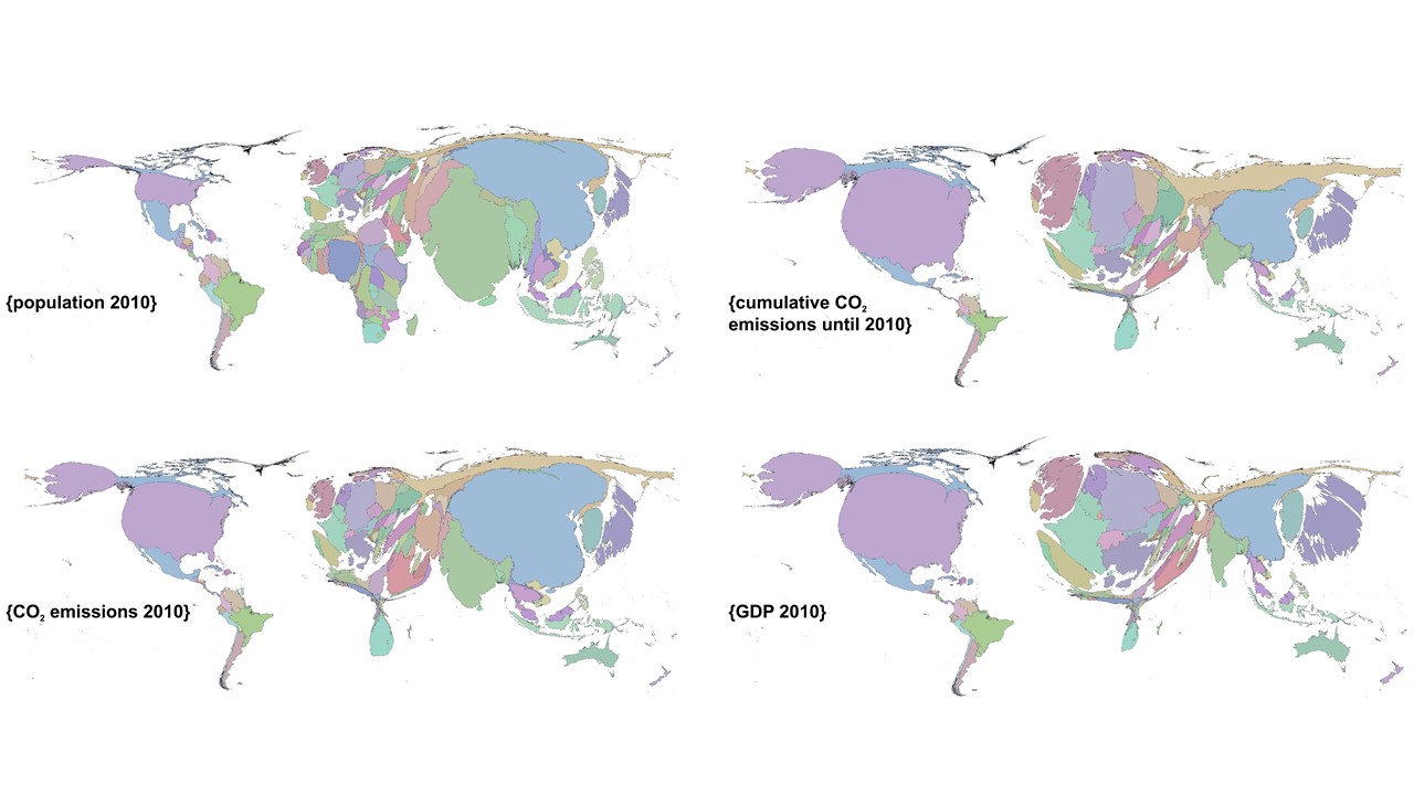
A cartogram set that visualizes the relation between population numbers, carbon dioxide emissions, and wealth of countries. These cartograms distort country size by population in 2010, fossil-fuel carbon dioxide emissions in 2010, cumulative fossil-fuel carbon dioxide emissions from pre-industrial to 2010, and gross domestic product (GDP) in 2010.
Credit: Petra Döll
Döll, who was the lead author of the Intergovernmental Panel on Climate Change’s report on freshwater resources, believes that future assessments should include cartograms as an effective way to express climate change risks. She believes cartograms are good tools for demonstrating how humans are impacted by climate change risks.
“When we look at a normal map, the attention goes to areas where nobody lives: north of Canada, Siberia, or the desert,” Döll said. Cartograms, on the other hand, emphasize the regions where people are affected by climate change hazards.